
需求场景
做 PC 端大屏可视化项目时,设计稿基于 1920×1080 做的。实际部署时屏幕分辨率千差万别 —— 客户的会议室大屏 3840×2160,自己开发机器 2560×1440,用户笔记本 1366×768。要让同一份代码在所有屏幕上都按比例完整显示,需要动态缩放。
思路:整个容器的 transform: scale() 跟着 viewport 尺寸算,以 1920×1080 为基准,大屏放大、小屏缩小。比写一堆 media query 简单得多。
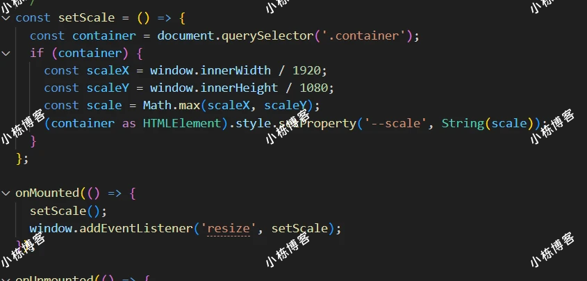
核心代码
<template>
    <div class="container">
        <div class="item"></div>
    </div>
</template>
<script setup lang="ts">
import { onMounted, onUnmounted } from 'vue';

/**
 * 设置元素缩放比例
 */
const setScale = () => {
    const container = document.querySelector('.container');
    if (container) {
        const scaleX = window.innerWidth / 1920;
        const scaleY = window.innerHeight / 1080;
        const scale = Math.max(scaleX, scaleY);
        (container as HTMLElement).style.setProperty('--scale', String(scale));
    }
};
onMounted(() => {
    setScale();
    window.addEventListener('resize', setScale);
});
onUnmounted(() => {
    window.removeEventListener('resize', setScale);
});
</script>
<style scoped>
html,
body {
    margin: 0;
    padding: 0;
    width: 100%;
    height: 100%;
    overflow: hidden;
}
.container {
    position: absolute;
    top: 50%;
    left: 50%;
    width: 1920px;
    height: 1080px;
    transform: translate(-50%, -50%) scale(var(--scale, 1));
    transform-origin: center center;
    background: url(https://xxxxxpc-1.webp) top no-repeat;
    background-size: 100% 100%;
}
.item {
    width: 100px;
    height: 100px;
    background-color: red;
    position: absolute;
    left: 100px;
    top: 50px;
}
</style>
关键点解读
1. scaleX / scaleY 分别计算:
const scaleX = window.innerWidth / 1920;
const scaleY = window.innerHeight / 1080;
分别算横向 / 纵向缩放比例。比如 4K 屏(3840×2160):scaleX = 2, scaleY = 2。1366×768 屏:scaleX ≈ 0.71, scaleY ≈ 0.71。
2. Math.max 取较大值:
const scale = Math.max(scaleX, scaleY);为什么 max 不是 min?
- Math.max —— 优先填满屏幕,会有部分内容被裁(超出 viewport)
- Math.min —— 完整显示所有内容,但留有黑边
大屏 BI / 数据看板场景,通常要"看着震撼"(填满优先),所以 max。如果是仪表盘里关键数据不能裁切,改成 min。
3. 用 CSS 变量传值:
container.style.setProperty('--scale', String(scale));JS 把 scale 值塞到 CSS 变量里,然后 CSS 里用:
.container {
    width: 1920px;
    height: 1080px;
    transform: scale(var(--scale, 1));
    transform-origin: top left;
}
--scale 是 CSS Custom Property,JS 改,CSS 读。这种"数据驱动"模式很现代,比直接 container.style.transform = ... 优雅。
完整组件示例
<template>
    <div class="screen-wrap">
        <div class="screen-container">
            <!-- 你的内容,1920×1080 设计稿 -->
            <h1>数据大屏</h1>
            <div class="chart">...</div>
        </div>
    </div>
</template>

<script setup lang="ts">
import { onMounted, onUnmounted, ref } from 'vue';

const scale = ref(1);

const calcScale = () => {
    const sx = window.innerWidth / 1920;
    const sy = window.innerHeight / 1080;
    scale.value = Math.max(sx, sy);  // 或 Math.min
};

onMounted(() => {
    calcScale();
    window.addEventListener('resize', calcScale);
});

onUnmounted(() => {
    window.removeEventListener('resize', calcScale);
});
</script>

<style scoped>
.screen-wrap {
    width: 100vw;
    height: 100vh;
    background: #000;
    overflow: hidden;
}
.screen-container {
    width: 1920px;
    height: 1080px;
    transform: scale(v-bind(scale));
    transform-origin: top left;
    background: linear-gradient(135deg, #001a33, #003366);
}
</style>
这版用 Vue 3 的 v-bind 在 CSS 里直接读 ref,比手动 setProperty 简洁。
居中显示版
上面的代码是 transform-origin: top left,放大后内容从左上角扩展,可能超出右下边界。如果想整体居中显示:
.screen-wrap {
    display: flex;
    justify-content: center;
    align-items: center;
}
.screen-container {
    transform-origin: center center;
}
这样无论缩放多少,内容都居中。
避免文字模糊
用 transform: scale 缩放时,如果元素里有图片或者非整数像素的边框,可能出现模糊。解决:
.screen-container {
    transform: scale(v-bind(scale));
    will-change: transform;
    backface-visibility: hidden;
    /* 关键:让 GPU 加速渲染 */
}
或者用 zoom 替代 transform(不标准但 Chrome 支持好):
.screen-container {
    zoom: v-bind(scale);
}
zoom 渲染更清晰,但不支持小数(可能?),只有部分浏览器支持,不能完全替代。
大屏开发常见问题
1. 字体小屏看不清
设计稿 1920 上字号 14px,缩放到 1366 屏变成 10px,基本糊了。建议设计稿字号别低于 16px,基础字号 18-20px 更安全。
2. 图表 (ECharts / G2) 不跟着缩放
很多图表库根据父容器实际像素重新绘制。transform 改的只是显示,DOM 还是 1920×1080。图表会按 1920×1080 渲染,跟周围元素同步缩放,通常 OK。但如果图表内部有"按 viewport 算字号"的逻辑,可能错位。
3. 鼠标事件位置不对
transform 后,点击事件的 clientX/Y 仍是 viewport 坐标,转成"原始内容坐标"需要除以 scale。
替代方案
除了 transform scale,大屏适配还有几种:
- rem + lib-flexible —— 跟移动端方案一样,根字号跟 viewport,每个元素用 rem
- vw 单位 —— 直接用 vw 写所有尺寸,纯 CSS 适配
- 响应式布局(media query)—— 不同断点不同布局,适合内容差异大的场景
| 方案 | 优点 | 缺点 |
|---|---|---|
| transform scale | 写代码完全按 1920 设计,简单 | 字体 / 边框可能模糊 |
| rem / vw | 渲染清晰 | 所有 px 要换算 |
| 响应式 | 每种屏幕最佳布局 | 代码量大,断点麻烦 |
BI 大屏看板首选 transform scale,工作量最小;高保真 H5 应用首选 vw;通用网页用响应式。






正在读取登录状态…
暂无讨论,说说你的看法吧